This essay will discuss and analyse two critical reviews on Harry Callahan. The essay will also look at a range of Callahans images and how theories and ideas can be applied to his work. The first critical reviews being discussed is: ‘Review: Harry Callahan photography exhibition at the National Gallery’, Phillip Kennicott, (October 4, 2011). The second critical review is: ‘Art Review: Impact Of Harry Callahan’s Color Photography Has Faded With Time’, Cathy Curtis, (October 7, 1988).
The first critical review being discussed is ‘Review: Harry Callahan photography exhibition at the National Gallery’ Phillip Kennicott (October 4 2011).
Kennicott discusses how Callahans photographs on display “draw the eye into a world that is meticulous but complicated” (Kennicott, 2011). This statement draws on how Callahan was part of the New Vision movement of photography which took place in the 1920s and 1930s’. this movement saw photography move from documentary style genres to more Avant Garde and abstract images. Kennicott continues “carefully constructed visual games using strange angles, reflective surfaces and strong contrast” (Kennicott, 2011). Callahans images were extremely experimental and he often used double exposures with his images to create more abstract images.
Although Callahan photographed nature and street scenes, he would also photograph his wife Eleanor, mainly nude. These photographs would either become pieces themselves or be double exposed images layered contrasting patterns of natural scenes. Kennicot talks about an image Callahan took of Eleanor in 1947. “[the] image of what appears to be the lines created by Eleanor’s legs and buttocks looks like a Clycladic statue, relentlessly rectilinear but soft around the edges” (Kennicott, 2011). This suggests that Callahan would look at the human body and look at how its form would create natural lines. The image could have also been abstraction, as Callahan focused on a specific part of the body, framing the photograph so just the legs and buttocks are in frame, isolating the view to just the lines created by this part of the body.
Kennicot continues to discuss Callahans photography style. “no matter how much Callahan’s camera dissects the world, the photographs never seem clinical” (Kennicott, 2011). Callahan would have been documenting the changes of then environment around him and was photographing these changes but was applying creative techniques and was focusing on specific aspects of these cities. An example of how Callahan would do this is he would photograph a busy street but to create the illusion of more people, Callahan would double expose the images over itself.
Kennicot also describes Callahans images as “small vignettes from the larger city” (Kennicott, 2011).
This statement seems to reference how Callahans landscape and street images were abstract or had some creative twist on them. Callahan would usually photograph streets but use double exposures to create chaotic images. He would also focus on a person, usually a woman, and double expose the image onto different street settings, so just a close-up face is shown floating in a street of people. this image could show Callahans documentation of the types of people seen on the streets, showing the division of wealth and classes.
In his final paragraphs, Kennicot discusses how Callahan would travel, particularly to Peru, Ireland and Morocco. The images Callahan was producing were “not the Peru of National Geographic, or postcards” (Kennicott, 2011), they were contemporary and abstract images, that were showing the locations in an artistic setting instead of documentation.
The second critical review being discussed is ‘Impact of Harry Callahan’s Color Photography Has Faded With Time’ Cathy Curtis (October 7, 1988).
Curtis states “subjects that, in vintage black-and-white prints, may suggest a meaningful and personal point of view, often seem disappointingly bland and banal once in colour” (Curtis, 1988) suggesting that images seem more emotional and dramatic in black and white, whilst colour images of the same subjects lose the symbolism intended.
Curtis continues to describe how Callahan “began photographing urban street scenes in black-and-white in the early 1940s” and that “one of Callahan’s longstanding themes is the essential loneliness of individuals caught up in the random patterns of pedestrian traffic” (Curtis, 1988). This black and white approach to Callahans images would have given them a more emotional effect as colour would have distracted from the meaning of the image. Removing colour from images of individuals could symbolise the loneliness they feel in their busy surroundings.
Callahan would “focus[ing] on women, who’s harsh, set faces somehow reflect both public masks and private vulnerabilities” (Curtis, 1988) possibly touching on women’s place in society in the 1940s, how they would appear to be the perfect house wife but still hold insecurities. Curtis continues “Callahan was also intrigued by the staccato pace of urban life, which he registered in discreet double-exposures” (Curtis, 1988) describing how Callahan would photograph close-ups of women’s faces and double expose them on busy street scenes to show the isolation of an individual in a busy city.
Harry Callahan could “afford to travel widely” meaning his images would come from a range of cities. “Signs in Arabic lettering (in Egypt), intricately decorated building facades (in Portugal) and yellow New York City taxicabs” (Curtis, 1988). All his images were now in colour as in 1977, “he gave up black and white completely” (Curtis, 1988). It was rare for people to be able to travel so Callahans images became a way for people to experience different countries and cultures. Curtis explains “this work is impeccable, crisp, colourful – and dead. Callahan seems to be on auto-pilot, spitting out pleasant pictures that tell us what we already know” (Curtis, 1988). This suggests that Callahan was only showing images that were plain “tourist” looking images, whereas his black and white images were meaningful and showed a more emotional approach to his images.
Phillip Kennicotts’ article describes Callahans images as explorative and innovative, as Callahan was a part of the New Vision movement, where artists were starting to experiment with their artistic medias to create interesting pieces.
Cathy Curtis’ article looks at the Callahans colour images and how the impact of his photography changed once he moved exclusively to colour photography. This outlook could be true, as Callahan was able to afford travel, so could have documented his travels in interesting ways, but instead decided to focus on photographing idyllic images that would please viewers, rather than inviting them to look more into the meaning of the images.
Moving forward to analyse Callahans images based on the two reviews, it would be interesting to look at the experimentation discussed by Kennicot. It would also be beneficial to look at Callahans colour images and look at the impact they have over his black and white images.
The first image is ‘Eleanor, Aix-en-Provence’, (France, 1958) (figure 1). The image depicts a filed with a double exposure of the naked back of a woman. The woman in the image is Callahans’ wife, Eleanor. Whilst talking about Callahans’ images of Eleanor, Kennicott explains “they are markers of intimacy that Callahan never violates by double exposure” (Kennicott, 2011). This suggests that the images are never taken in a sexual way but as a way to experiment with the lines and form of a body overlapping a natural scene. The image also shows a connection to nature, as the naked torso in an open field suggests freedom.
Looking at Curtis’ view on Callahans images, black and white has a more emotional impact on the image, as the removal of colour gives the image a simplistic look that would have been more chaotic had the image been in colour.
Kennicotts’ interpretation of Callahans images is more effective whilst looking at ‘Eleanor’ as Kennicott looks at how Callahan was experimental with his images and would use double exposures to create abstract images.
Image two is ‘The Street’ (no date) (figure 2). The image is of a woman’s face layered on a busy street scene, giving the impression of loneliness. The woman is attractive, and her hair has been styled perfectly. In the background are mannequins in a shop window, that have the same hairstyles as the woman who has been singled out. This gives the impression of people being clones of other people and nothing being original.
Phillip Kennicotts’ article describes Callahans’ images as “draw[ing] the eye into a world that is meticulous but complicated” (Kennicott, 2011). This statement suggests that the images seem normal at first glance, but as you read more into Callahans images, you can see more depth and complexity in the composition of the image. The floating head of the woman catches the viewers’ attention first, and when you look further into the image you notice how she looks transparent. Kennicott also describes Callahans images as “carefully constructed visual games using strange angles, reflective surfaces and strong contrast” (Kennicott, 2011).
Cathy Curtis’s article talks about how “one of Callahans longstanding themes is the essential loneliness of individuals caught up in the random patterns of pedestrian traffic”. With figure 2 Callahan has captured the face of a woman who looks confused, and the double exposure of the image on a busy street, gives the impression of impression that she is lost in the crowd. Curtis continues “Callahan’s photographs have been read as indicative of the then-fashionable dilemma of the individual forced to make his or her way in a cold shoulder world”. The people in the image are walking in the same direction but the woman is looking in the opposite direction, as though she is going against the crowd. This could also be interpreted as the woman leaving the safety of following the same direction as everyone on the street and going in her own direction on her own.
Curtis’s interpretations of Callahans images are most effective for figure 2, as Curtis explains Callahans themes of images more in depth which fits the narrative of figure 2’s subject and compositions.
Another experimental image by Harry Callahan is ‘Detroit’,(1943)(figure 3). The image is of a busy street in Detroit that has been double exposed with the same composition. The streets are busy with people and traffic, all moving in the same direction. Also noticeable in the image is a sign saying: “no turn”, which is near a crowd of people all following the same direction and not breaking the flow of people. Within the image it is clear there are a range of people and social classes. Near the bottom of the image is a maid and in front of her are upper class people that are recognisable by their clothing. In his review, Phillip Kennicott says about Callahan “He divorces things from context, pulls out small vignettes from the larger city, but without violence, and without the gamesmanship of a photographer inclined to the cheap surreal” (Kennicott, 2011). This statement is true for the image, as Callahan has isolated a street scene and focused on focusing on this one spot without showing the location. “[T]he cheap surreal” (Kennicott, 2011), suggests that by using double or more exposures, Callahan has been able to create unique an interesting street photographs, whereas other photographers may photograph the same scene in a matter of fact way, without any experimentation.
Looking at Cathy Curtis’s review on Callahans work, the statement: “subjects that, in vintage black-and-white prints, may suggest a meaning and personal point of view, often seem disappointingly bland and banal in colour” is true with figure 3. Had the image been in colour, the image would have looked very chaotic and details would have been lost. The image in black and white looks more vintage and shows more details in the tones and shadows.
Phillip Kennicotts’ view on Callahans photography is more effective looking at figure 3 as Kennicott was able to interpret how Callahan photographed street scenes in creative ways and also show urban life in busy city streets.
The final image being discussed is ‘Providence’. The image is a coloured double exposure print of what looks like a poster on the wall of a normal street. The ‘poster’ looks as though it has a president or political figure as the subject. Another noticeable thing with figure 4 is that the eyes of the ‘poster’s’ subject look as though they are glowing red, like a demonic presence, which could be read as a political statement against the Government.
Curtis states “the way people perceive art photographs inevitably has a lot to do with the crush of promotional imagery that leaps out everywhere in magazines, on billboards and on TV”. This quote looks at how we are surrounded by images every day and can be easily influenced by the imagery we see. If people see a promotional image for a long period of time, they might be influenced to change things about their lives, such as political opinions or lifestyle choices.
Curtis also states about Callahan “he is not in the business of making social statements. When his work has suggested a particular depth of meaning, that meaning has been colored by the attitudes of his era” (Curtis, 1988). This statement suggests that Callahan never photographs images with a political meaning, however viewers can look deeper into the image and form their own opinion.
Curtis’s explanation of how people perceive images and political messages within Callahans image fits with figure 4 as Curtis has explained that imagery surrounds us on a day to day basis and can easily influence opinions based on what is shown.
Overall, ‘Art Review: Impact Of Harry Callahan’s Color Photography Has Faded With Time’, Cathy Curtis, (October 7, 1988) is able to describe Callahans themes and meanings behind his images. Although Curtis is writing against Callahans colour images, she argues the point that his black and white images hold more meaning and more emotional value over his colour images. Curtis describes Callahans colour images as “impeccable, crisp, colourful – and dead”, alluding to how it seems as though Callahan was taking photos that were typical touristy images that hold no further emotional meaning.
‘Review: Harry Callahan photography exhibition at the National Gallery’, Phillip Kennicott (October 4 2011), describes Callahans nude images more than his other styles. The main subject of Callahans nude images was his wife, Eleanor. Kennicott describes Callahans approach as “they are markers of intimacy that Callahan never violates by direct exposure” (Kennicott, 2011), showing us that the nude images were never taken in a sexual way, they were experimental images for Callahan to use with double exposures to create more abstract images.
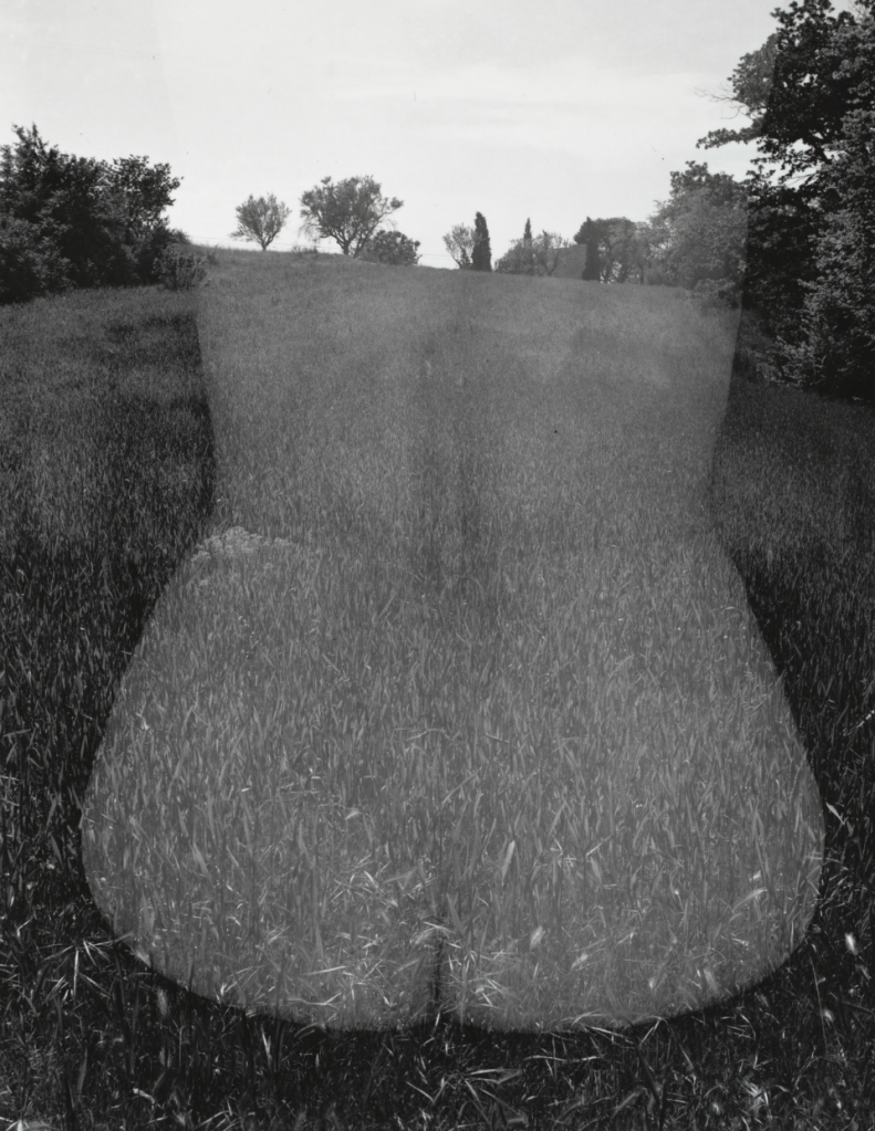
Figure. 1:
Callahan, H. (1958). Eleanor, Aix-en-Provence, France.
Available at: https://www.moma.org/collection/works/54519.

Figure. 2:
Callahan, H. (1943). Detroit.
Available at: https://www.artforum.com/picks/harry-callahan-29735.

Figure. 3:
Callahan, H. (no date). Unknown.
Available at: https://erickimphotography.com/blog/2015/01/20/7-lessons-harry-callahan-has-taught-me-about-street-photography-and-life/.

Fig. 4
Callahan, H. (1985). Providence.
Available at: https://www.e-flux.com/announcements/12523/harry-callahanthe-street/.
Reference List:
CURTIS, C. (1988). ART REVIEW : Impact of Harry Callahan’s Color Photography Has Faded With Time. [online] Los Angeles Times.
Available at: https://www.latimes.com/archives/la-xpm-1988-10-07-ca-3457-story.html
[Accessed 4 Jan. 2020].
Kennicott, P. (2011). Review: Harry Callahan photography exhibit at the National Gallery of Art. The Washington Post. [online] 5 Oct.
[Accessed 4 Jan. 2020].


